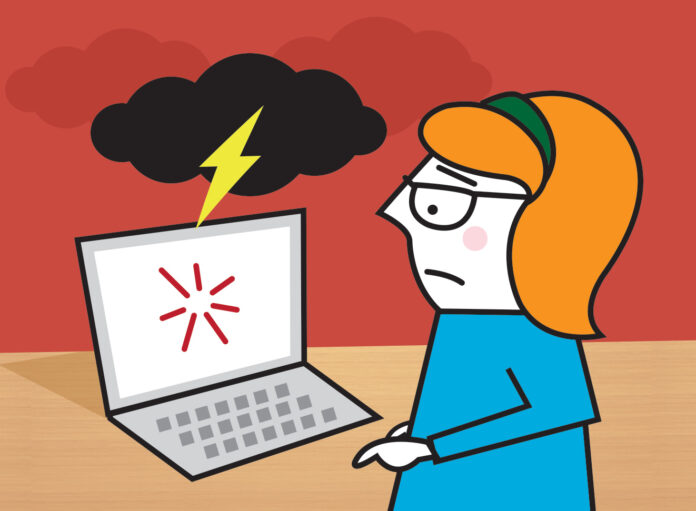
What to Say in User Friendly Error Messages
The best error messages are, obviously, those that don’t show up at all. But we are all human, and we all make mistakes; ergo, our programs and software make mistakes, too. No matter how good a design is, errors are often unavoidable, and things inevitably go wrong.
Chances are, as an internet and computer user, you’ve encountered a frustrating and poorly worded error message. These messages are pretty standard and may contain a lot of jargon, like ‘the application failed to initialize because the window station is being shut down.’
You may be left thinking: what does that even mean?!
Error messages may seem trivial and inconsequential, but they go a long way in defining a user’s experience and satisfaction with a product. Poorly written error messages do irritate users and can lead them to stop using a product. On the other hand, a well written error message can alleviate a user’s annoyance with the error and drive up customer satisfaction. Remember: a product should be usable enough to handle a user’s erroneous actions, or the software’s mistakes, gracefully.
A good, user-friendly error message should identify:
- What the problem was
- Why it happened
- How you can solve it/ prevent it from happening again
So, in this post we’ll share some fool proof ways to write and design user-friendly error messages, for optimal user experience.
Customize the error message to the User’s Task
As noted, error messages are usually pretty standardised: this can be frustrating for user’s who want to know specifically what error has occurred.
“It can be confusing when a website error message doesn’t contain any details about what went wrong, particularly if they are inputting personal data or completing a checkout (this can cost you, as a business, sales!). We’ve all been there – trying any number of different upper and lower-case letters and number combos to have a password be accepted or retyping our card number 5 times only to realise the form wanted spaces in between!” Says Carley Gordon, a marketer at Australian help and Paper fellows.
Don’t let this be the fate of your error message. Ensure to always identify the problem, customising the message to the user’s task, and provide a way to correct the issue. With the right guidance, users will remain engaged and make the necessary corrections – which could mean the difference between a sale or a lead generation for you!
Don’t be a Robot
No, really – we’re all sick of those captcha messages accusing us of not being human, but your error messages need to contain as little technical jargon as possible and hold onto the human element to be successful.
“A technical, generic error message that places blame on the user is not the sort of error message anyone wants to read,” says Mai Beech, a business writer at Boom essays and State of writing. “Aim to be friendly, understanding, and explanatory. Imagine your error message read aloud to someone in conversation: this is a good way to check the tone!
Be funny
Another way to stay human is to use humour. Not all situations require humour, naturally – use your judgement, and keep the message informational and tasteful. You could use something like Window’s jokey error message ‘task failed successfully’ but follow up with an explanation why.
Make it easy for users to fix the problem
Again, there truly is nothing more frustrating than an error message that keeps appearing with no steps to solve the issue.
Help your users get through a task efficiently and successfully by telling them what was incorrect.
For instance, if it’s a username or password error, tell the user which was wrong. Given that the average user has over 10 passwords and 4 usernames at any given time, it can be endlessly frustrating trying to figure out which part of the login was wrong.
So, in summary: keep error messages specific to the user’s task, avoid overly robotic technical jargon, remain friendly, use humour and tell the user what their error was. Remember that a well-designed error message should always identify what the problem was, why it happened, and how they can prevent it from happening again.
When designing error messages, aim to be holistic: think about what could go wrong in your service and design concise, useful and human error messages for each. Don’t forget to test these error messages with real users – firstly to check the solutions work, and secondly to check the quality of the error messages!
Error message writing may seem insignificant, but it can really impact user experience. Everything that aids your users to have a better customer experience is significant – start now with designing the best user-friendly error messages!


![Avast Driver Updater Key 2022 | Activation Key V2.5.9 [Free]- Avast Driver Updater Key 2021](https://vintank.com/wp-content/uploads/2021/02/Avast-Driver-Updater-Key-2021-100x70.jpg)
![Avast Premier Activation Code and License Key [Working] Avast Premier Activation Code and License Key](https://vintank.com/wp-content/uploads/2021/09/Avast-Premier-Activation-Code-and-License-Key-100x70.jpg)
